The art you choose for your home does more than fill empty walls — it subtly shapes how you feel in each space. From calming bedrooms to energising work areas, typography wall art plays a powerful role in setting the emotional tone of your home.
It’s no secret that the kind of art you hang in your home can have a big impact on your overall mood. But why do certain typography wall art styles make you feel a particular way? And how should you decide which prints to put where in your home to maximise a good mood?
So What Is The Psychology of Typography?
In short, studies show that fonts, spacing and layouts of different prints can subconsciously impact your emotions, moods and your behaviours, and whilst it’s normally been used to determine how people will interact with brand content and copy, the kinds of prints you display in your home also have an impact on your mood.
Within seconds of you seeing a font, your brain has already made judgments. Most of the time, you don’t even realise you’re doing it! Whilst it’s common for us to think of images evoking particular moods or emotions, typography also has a major impact.
For example, tight spacing can provide a sense of urgency, which might lead to you experiencing that feeling when you’re at home, whilst wide spacing encourages a slower pace, leading to a more relaxed mood.
Do Fonts Matter?
The fonts that are used on your chosen prints have a big impact on how you’re
going to feel overall, and whilst you may not even realise it as you’re choosing prints, the type of font really does matter.
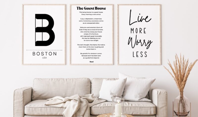
Fonts like Times New Roman feel classic, and they’re perfect in reading corners, living rooms, or anywhere you’re looking for a more timeless feel. Script fonts, on the other hand, provide a more artistic and romantic feel, making them more suitable for areas where you want to relax, like bedrooms.
View this post on Instagram
What About The Actual Phrases?
This one might be a bit more obvious, but the actual words written on your prints have a large impact on the way you feel. If you want a sense of calm, it might be better to choose prints that have positive affirmations written on them.
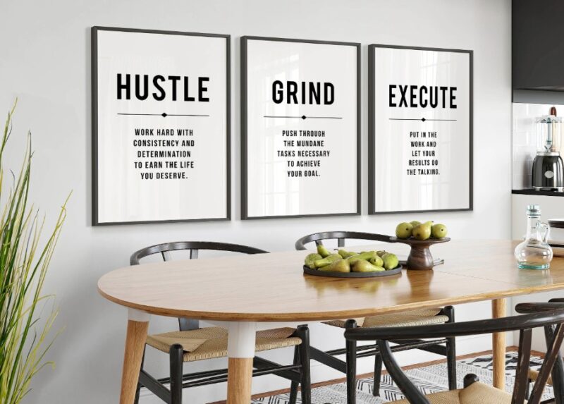
But if you’re looking for something to put in your home office, more motivational phrasing might give you the boost you need to get through your workday. Choosing typography prints that have phrases or words that best emulate the vibe of your space really is the key.
Does Colour Matter?
Outside of the typography of your chosen prints, the colour you chose for your space also really matters.
If you want to place prints in areas where you’re looking to relax, opt for neutrals, blues or greens. However, if you’re looking for motivation, yellow or orange might be a better choice for you.
Choosing the colour of your prints with intention can help support the way you want a room to feel. You probably wouldn’t want a bright red print in your bedroom, which is meant for winding down, however, it might do well in your kitchen, as it promotes hunger and has a more energetic feel.
So, Where Should I Place Particular Prints?
If you’re feeling a bit overwhelmed with all this information, these are the key cheat codes you can use to know where to put each print to maximise mood:
- Home office: Opt for yellows, oranges and words or phrases that evoke a sense of motivation and creativity
- Bedroom: Greens, blues and neutrals work well here as well as calming words and phrases and script fonts.
- Communal spaces: The world is your oyster here. If you want it to be a more relaxing space, choose script and neutral colours. But if you want it to be more fun and playful, opt for bold colours and fonts in these areas.
Long Story Short ─ Typography Matters
The way you choose your prints, even down to the typography, is key to ensuring your home evokes the moods you want. By carefully selecting your typography prints, you can create a space that feels warm, welcoming and aligns with your individual style.