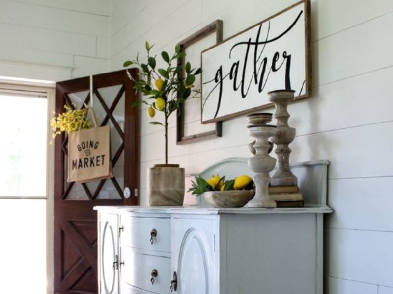
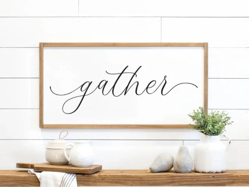
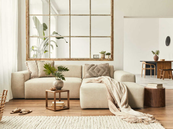
So I hear you’re thinking of putting up a little sign inviting people to gather in the living room, huh? Now before breaking out the tools and risking damage to those lovely fresh paint walls, humor me a moment while I share a viewpoint on blending signs with other decorations.
The trick is finding complementary accents that allow the sign to feel more like a thoughtful part of the overall style than something slapped on.
Things like plants, art, and photos of family – are accessories that give context and project an inviting spirit without distraction. And of course, placement plays a big role in achieving harmonious flow.
Overall what matters is selecting decor that uplifts your soul each time you enter the room. I just want to help ensure whatever you decide reflects who you are rather than following a trend.
Choosing the Right Style

The material of your gather sign can greatly influence the overall look and feel of your living room.
When it comes to signs, there are plenty of viable options offering their own special charm. Wood carries an air of comfort and history – I can picture its warmth in a home with a touch of nostalgia.
Sleek metal also has its place, suiting minimalist aesthetics with flair. And acrylic lends a polished yet flexible accent for contemporary tastes.
Of course, how anything fits in relies on syncing with what’s already there. That’s where color comes in. I know from experience – the wrong tones can muddle a room’s vibe faster than you can say “oops!”.
So take the time to feel out existing hues before introducing anything new. A bit of boldness against neutrality could be just the balance needed. Or perhaps a sign bearing mellow shades serves as the ideal counterpoint for lively surroundings.
Strategic Placement of the Gather Sign
Visibility is key, yet startling visitors defeats the purpose of warmth. A guiding beacon above focal points like the lounge area or fireplace allows eyes to settle naturally. Another option, greeting arrivals by the entryway, conveys welcome from the start.
The priority lies not in demanding attention but rather subtly steering it towards your intended atmosphere. Balance is the name of the game – a sign should shine some light without overpowering complementary aspects around it.
With a bit of tuning, you can leverage its directional powers while still maintaining cohesive flow. It’s about blending guidance into the bigger picture seamlessly, so both sign and space sing in harmony.
Complementing Accessories

If your sign is made of rustic wood, you’ll want to find other rustic things to go with it. Something like picture frames, candle holders or baskets made of wood too. That way it all matches and feels cozy together.
Now say your sign is shiny metal. Then you’ll need other shiny metal things near it so it doesn’t look lonely! Put up some lights, tables or knick knacks that have the same finish. Presto – now you’ve got yourself a nice metallic theme going on!
Summary
You can integrate a gather sign into your living room decor, and this is not just about enhancing the space aesthetically but also about fostering a welcoming environment for friends and family.
With your thoughtful consideration of style, placement, and complementary accessories, you can be at peace that this will transform your living room into a hub of warmth and gathering, making every moment spent there truly special.


