Wall art is the element that finishes a room. Furniture sets the structure, flooring sets the tone, paint provides the backdrop — but art is what makes a space feel inhabited by a specific person with a specific sensibility. It’s also, paradoxically, the element that most homeowners treat as an afterthought.
The result is a very common interior design problem: rooms that are perfectly serviceable and completely characterless. Good furniture, decent lighting, not a wrong choice anywhere — but no personality, no presence, nothing that says anything particular about the people who live there.
This guide addresses that problem directly. It covers the selection, sizing, positioning, and installation principles that professional interior designers use — and explains how to apply them practically in a UK home, from a Victorian terrace to a new-build open-plan flat.
The Most Common Wall Art Mistake (and Why Everyone Makes It)
Before getting into principles, it’s worth naming the single most pervasive wall art mistake in UK homes: choosing art that’s too small for the wall it occupies.
Walk through any home and you’ll see it everywhere — a modestly sized print hanging alone on a wide chimney breast, a small canvas above a large sofa, a collection of tiny frames scattered across an expansive wall with no compositional logic.
The pieces might be perfectly good in themselves, but they look wrong because they’ve been scaled incorrectly to their environment.
The reason this happens is obvious once you spot it: small art is cheaper and easier to handle than large art. A 40x50cm print from a high street shop is affordable, fits under your arm, and requires one nail. A 100x140cm canvas requires real investment, careful transportation, and proper installation. So people buy small and the walls look bare.
The interior design fix is simple but requires committing to a different approach: think about scale first, then find art at the right size, not the other way around.
How to Get Scale Right in Every Room
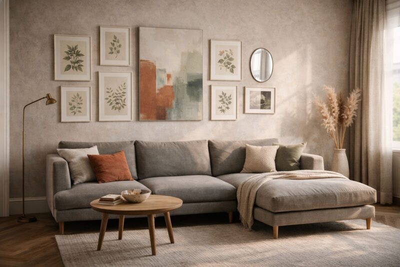
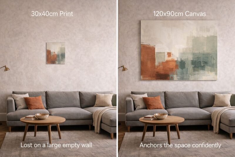
Scale decisions in interior design follow a consistent logic. The dominant art piece in a room’s focal zone — the wall above a sofa, the chimney breast, the wall facing you as you enter — should be large enough to anchor the wall visually.
In practice, this typically means the art should span at least 50–60% of the wall width, or the width of the largest furniture piece below it.
For a sofa measuring 220cm wide, the ideal art above it is somewhere between 110cm and 155cm in its widest dimension.
This might be a single large canvas, a diptych (two matching panels side by side), or a carefully composed gallery wall that fills the equivalent visual space.
A useful designer’s shortcut: stand in front of the wall and imagine painting a generous rectangle to represent the art you plan to hang. If it looks proportionally correct in your imagination, it probably will in reality. If it looks small, it will definitely be too small.
UK print-on-demand suppliers including Printseekers have expanded their large-format offerings significantly in recent years, making it genuinely practical to source a 120cm canvas print at a price point that was previously only available for smaller formats. This has changed the accessibility calculation for homeowners willing to invest properly in scale.
Room-by-Room Guide to Choosing the Right Art
Different rooms have different functions, and the art in each should reinforce the psychological purpose of the space.
Living Room
The living room carries the most social weight of any space in a home. It’s where you host guests, where the household relaxes together, and where your aesthetic sensibility is most publicly on display.
The best living room art creates a focal point, reflects the room’s colour palette, and expresses a clear visual personality. It can be bold or subtle, maximalist or minimalist — but it should be intentional.
A large statement piece above a fireplace or sofa should be the design anchor from which other choices in the room (cushion colours, accessories, secondary art pieces) derive.
Avoid the common trap of buying art to match the sofa. The sofa can be reupholstered or replaced; art that was selected to match a specific piece of furniture will rarely survive a refresh without looking wrong.
Bedroom
The bedroom is a restorative space, and the art in it should support that function. Research from environmental psychology consistently shows that calm, lower-contrast images — natural scenes, soft abstract compositions, botanical prints in muted tones — contribute to lower pre-sleep arousal and better sleep quality.
That doesn’t mean bedroom art must be bland. A sophisticated botanical print in deep greens and terracotta, or a large abstract canvas in dusty pinks and warm beige, can be both visually striking and psychologically appropriate for a sleeping space.
Scale in bedrooms is frequently handled well above the bed (the proportional logic is the same as above a sofa) but badly elsewhere.
A narrow wall beside a window or between two doors is a good location for a vertical format print — the proportions of the space often suit the portrait orientation that is underused in living spaces.
Kitchen and Dining Room
Kitchens have historically been overlooked as spaces for art, but the shift towards open-plan kitchen-dining-living areas has changed this.
A kitchen wall now frequently needs to hold its own visually alongside well-designed living space.
Food and botanical art — illustration-style prints of ingredients, herbs, kitchen objects, or botanical studies — fits the kitchen context intuitively.
But the more interesting choice is often art that contrasts slightly with the utilitarian function of the space: a large abstract canvas or a photographic landscape in a kitchen creates a surprise that energises the room.
The practical consideration in kitchens is surface — avoid paper prints in proximity to cooking areas (steam and grease will damage them), and prefer canvas or metal prints that can be wiped clean.
Children’s Rooms
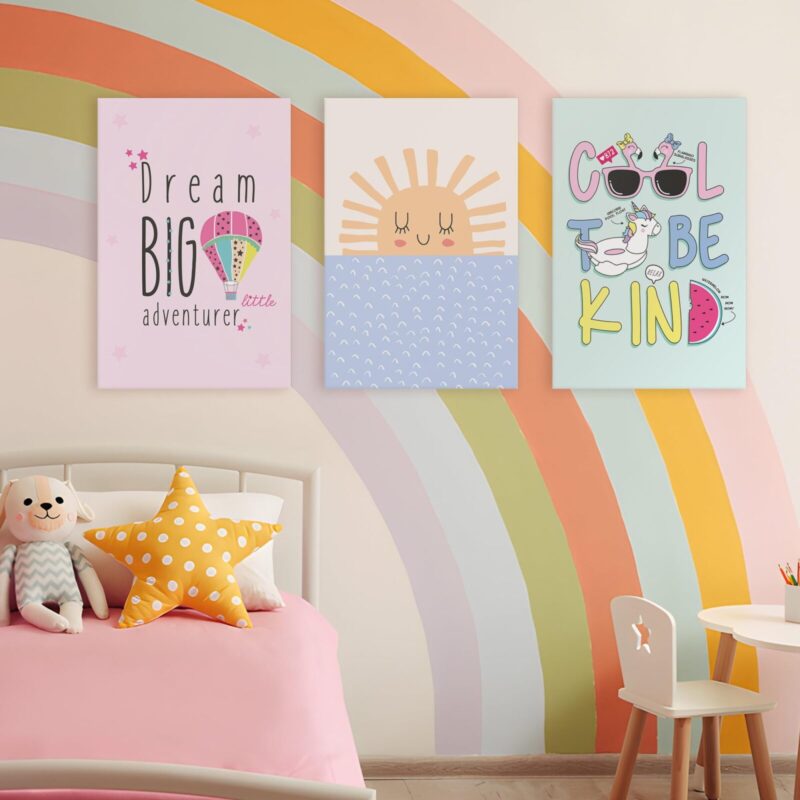
Children’s rooms present a specific challenge: you want art that delights and stimulates a child while being flexible enough to evolve as they grow.
The solution most experienced designers reach for is layered approaches — a fixed element (perhaps a wallpaper feature wall or a large canvas that grows with the child), supplemented by smaller, easily replaceable prints that can track the child’s interests as they shift.
Oversized typographic prints, illustrated maps, nature motifs, and character art all work. Custom name prints — a child’s name in bold lettering, or incorporated into an illustrated scene — have become one of the most reliable gift categories in wall art for exactly this reason: the personalisation gives the piece ongoing significance.
Home Office
The psychology of home office art is specific: you need visual stimulation that supports focus and creativity without distraction.
Research on “optimal stimulation levels” in cognitive environments suggests that moderate visual complexity — more stimulating than a blank wall, less chaotic than a gallery of competing images — produces the best sustained cognitive performance.
A single well-chosen large-format print, or a coherent small gallery wall with clear compositional logic, works better than a collection of unrelated items accumulated over time.
For people who work in highly analytical roles, structured geometric art, architectural photography, and orderly typographic prints provide appropriate visual stimulation without the narrative content that can pull attention.
The Technical Rules for Hanging Art
Beyond selection and scale, the physical installation of art follows specific rules that are frequently broken — with consequences that make even good pieces look wrong.
Hang at eye level. The standard recommendation in professional gallery and museum installation is that the centre of the artwork should be at 145–150cm from the floor, which corresponds to average eye height when standing.
Many homeowners hang art too high, drawn by the instinct to fill the upper portion of a wall.
The result is art that requires you to look up to see it, which feels uncomfortable and disconnects the piece from the room.
The exception: art above furniture should be positioned to relate to the furniture, not to a universal eye-level standard.
Art above a sofa should sit 15–25cm above the sofa back. Art above a bed’s headboard should sit 15–25cm above the headboard.
In both cases, you want visual connection between the furniture and the art, not a large gap that makes the piece look like it’s floating.
Centre art on its wall or visual zone, not on the room. A common mistake is centring a piece on the room’s centreline when it should be centred on the sofa below it, the chimney breast behind it, or the architectural feature it’s responding to.
Use a level. Crooked art is visually uncomfortable in a way that most people feel immediately but attribute to other causes.
A spirit level and a measure will save you from the most common installation error, which is trusting your eye when it’s being deceived by a subtly non-horizontal floor or ceiling.
Framed Prints vs Canvas vs Metal: Choosing Your Format
The format of a print — framed paper, stretched canvas, aluminium metal print — affects both the aesthetic character of the piece and its practical suitability for different rooms and environments.
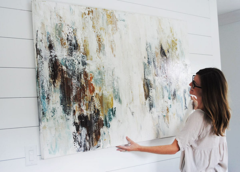
Stretched canvas is the most versatile format for most UK homes. It has a gallery quality without the formality of framing, holds up well in varying humidity conditions, and is available in a very wide range of sizes.
The textured surface adds visual depth that flat prints lack, and canvas prints can be hung without glass, which makes them lighter and easier to install at larger formats.
Framed prints offer a more considered, finished quality. The right frame can significantly elevate a print — a warm oak frame transforms the character of a botanical print; a black metal frame gives an architectural photograph a sharper, more editorial quality.
For paper prints, framing is also protective: glass protects against humidity and physical damage that would eventually affect an unframed print.
Metal prints (aluminium panels with images fused into the surface using dye-sublimation printing) are the premium option for contemporary homes.
They’re slim, heavy-feeling in a way that implies quality, completely washable, and produce colours with a vibrancy that no other print format matches.
Companies like Printseekers use Epson SureColor printing technology combined with specialised termopress equipment to produce metal prints with scratch-resistant, semi-gloss finishes that work particularly well in kitchens, bathrooms, and modern minimalist interiors.
Custom wallpaper is worth considering for homeowners willing to make a bold commitment.
A single feature wall covered in custom-printed wallpaper — whether a large photographic image, a repeating pattern, or a botanical illustration — creates a sense of scale and immersion that no framed piece can achieve.
Peel-and-stick options make this more accessible for renters or homeowners who may want to refresh the look without permanent commitment.
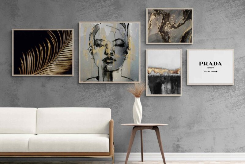
Gallery Walls: How to Make Them Work
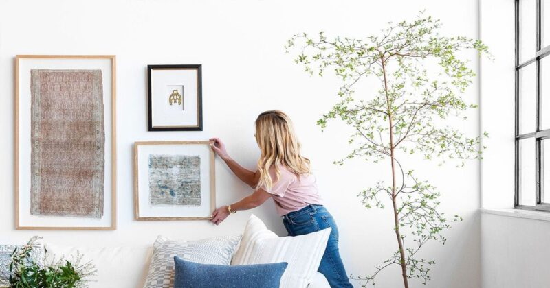
The gallery wall — a curated collection of multiple prints, photographs, and objects arranged on a single surface — is one of the most effective approaches to filling a large wall. It’s also one of the easiest to get wrong.
The principles that separate a gallery wall that looks designed from one that looks random:
Establish a system before you start hanging. Whether it’s consistent frame style, consistent mat colour, a repeating theme, or a consistent scale logic, some unifying element needs to run through the composition.
Lay it out on the floor first. Before making a single hole in the wall, arrange all the pieces on the floor in the configuration you plan to hang. Adjust until it works, then photograph it and use the photograph as a reference while hanging.
Mind the spacing. Gallery walls typically look best with consistent gaps between frames — 5–8cm is a common interval. Random spacing creates a sense of disorder that undermines the composition.
Include anchors. The most successful gallery walls have one or two dominant pieces that anchor the composition, with smaller pieces arranged around them. A composition of uniformly small pieces feels listless; a large anchor provides the hierarchy the eye needs to navigate the arrangement.
Updating Art Without Redecoration
One of the genuine advantages of wall art over most interior design interventions is its reversibility. You can completely change the visual character of a room by replacing art without touching paint, furniture, or flooring.
This makes art the most powerful fast-refresh tool available to homeowners. A living room that has grown stale can be substantially changed with two or three new large-format pieces and a rearrangement of existing ones.
The investment is modest relative to any furniture change and the effect can be immediate.
Print-on-demand services have made this more economically accessible than it was a generation ago.
A gallery-quality canvas print in a format that would previously have required either a significant budget or a commercial print run can now be ordered individually and received within days.
Printseekers fulfils individual orders for canvas, framed prints, metal prints, and wallpaper, with average production times of 1–3 days, which makes seasonal refreshes and experimental changes genuinely practical.
Conclusion: Art as the Final 10% That Makes the Room
Interior designers consistently say that the finishing touches — art, cushions, plants, objects — are the 10% of the work that delivers 50% of the impact.
The fundamental elements of a room (architecture, furniture, flooring, paint) establish the bones. Art is what gives the room its personality, its emotional register, its sense of being genuinely inhabited.
Getting it right doesn’t require an interior designer’s budget or an art collector’s knowledge. It requires the willingness to think intentionally about scale, placement, format, and meaning — and to invest in pieces that are genuinely sized and chosen for the spaces they occupy, rather than picked because they were available and affordable.
Start with the scale. The rest follows from there.