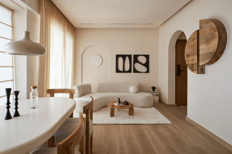
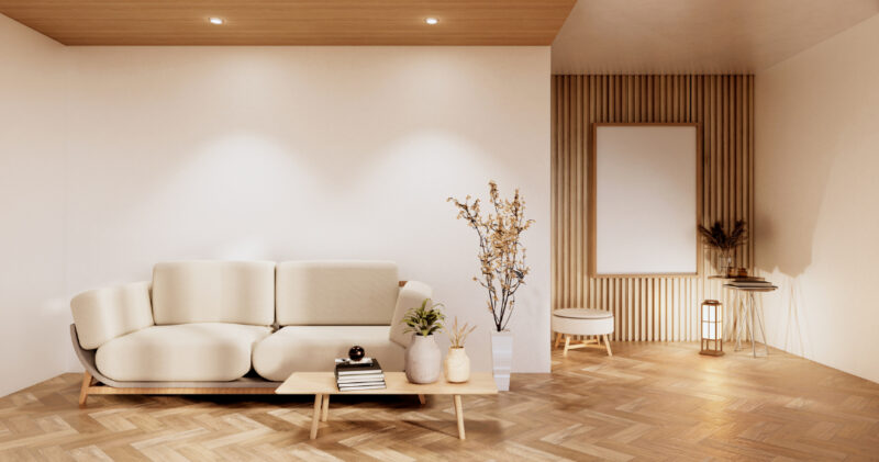
Walk into a flat that’s called ‘minimalist’, and there’s usually nowhere obvious for the eye to settle. Pale walls. A sofa low to the floor. Surfaces kept clear on purpose. Then, on one wall, a single enormous canvas of pure colour becomes the loudest addition to the space.
The contrast is not accidental and keeps turning up in interior photography, social media feeds, and within the rooms we would most like to be our own.
The Move From Empty to Intentional
Minimalism arrived in interiors as a style of having less. What the discipline does at its best is put pressure on a room. Clear it out, and every object left standing has to become worthy of the attention, because nothing nearby competes for it. Donald Judd built his life around this in Marfa, where small numbers of works sit in long reaches of bare floor.
A big abstract canvas runs on the same logic in a living room, drawing power from the metres of empty wall it is allowed to keep.
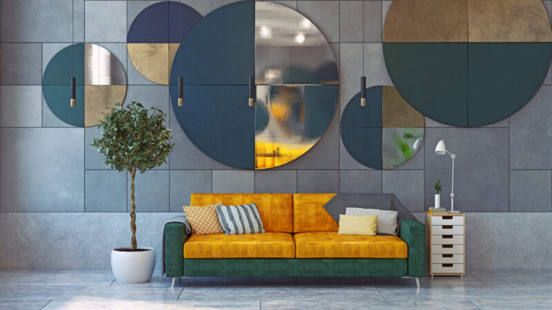
The gallery wall has lost ground for the same reason. A grid of a dozen small frames keeps the eye hopping between them, and in a sparse room, that constant motion starts to feel like a mess.
Why Abstraction Beats Representation in a Spare Room
Representational pictures struggle in these interiors for real, valid reasons. A painting of a harbour or a face contains a small world, and the brain treats it as information.
In a room built for saying less, the white noise of mental work is the wrong element. Colour field painting evades this. There’s nothing to identify in a Rothko or an Agnes Martin grid, so the looking never tips over into reading. There’s almost a sense of guided meditation through the mediation of enquiry and wonder.
The canvas appears as an atmosphere worth analysing, then accepting, the way a wall colour does. Scale is doing real work here, too. A small abstract print just looks like a swatch.
Past a certain size, colour stops feeling like a picture hung on the wall and becomes part of the room itself. Organised around a single piece of abstract wall art, a clean room is among the most reliable compositions for a property listing, since it gives the camera a focal point and leaves everything else muted.
Choosing the Piece Itself
Rule numero uno: A canvas that feels faintly too big in the shop usually hangs perfectly. Scale does most of the work. Then palette is a close second. A canvas aligned to the room’s colours sinks, so the useful pick brings in one note that the space is lacking.
The centre of the piece wants to be around eye level, lower than your instincts suggest, so it belongs to the room instead of drifting up toward the cornice. Frames stay minimal or disappear, a raw edge or a slim oak tray that keeps the attention on the colour.
The last habit is leaving it alone. No wall label, no paragraph about what the artist meant. A piece that can hold a room without a caption is doing the job for which it was hung.
A Trend With Staying Power
This is not the sort of thing that fades when the next colour chart goes viral on TikTok for a week. Behind it runs a deeper desire for fewer, better things. An abstract the size of a wall is where that desire comes into play; when a designer wants a room that says something by saying less.
One big, confident gesture, given room to breathe, is enough to curate an entire space. Above a vintage MCM sofa, that’s a few square metres of deep cobalt that says nothing special, but whoever hung it has decided that it says plenty.